Basics of UI Toolkit & UI Builder
UI Toolkit
This tutorial only covers the basics on UI Toolkit & UI Builder. You can find a more detailed walkthrough by following along with the Create an in-game inventory UI with UI Toolkit tutorial.
UI Toolkit completely changes the paradigm on how runtime UI is created. Gone are the days of the Canvas and GameObject based setup. Instead, you develop your UI with patterns similar to web design, including using style sheets. All components that you make can be reusable, making the design pattern a lot quicker. There are two key concepts that are important to building a new UI:
- Unity eXtensible Markup Language Documents (UXML): Defines the structure of the user interfaces and reusable UI templates.
- Unity Style Sheets (USS): Similar to Cascading Style Sheets (CSS), USS allows you to set visual styles and behaviors to your UI.
UXML and UI Document are two terms that are often used interchangeably during this tutorial.
There are many tools and resources that you can use throughout development to better understand how to setup your UI and how to debug issues:
- UI Builder: Visually create and edit your UXML and USS files. Located at Window > UI Toolkit > Debugger.
- UI Debugger: A diagnostic tool that lets you traverse the hierarchy of the UI to get useful information around the underlying structure and styling. Located at Window > UI Toolkit > UI Builder.
- UI Samples: Library of code samples for various UI controls. Located at Window > UI Toolkit > Samples.
UI Toolkit was originally designed as an alternative for IMGUI and many of the controls that you get out of the box with UI Builder do not work with the Runtime version.
UI Builder
UI Builder is a way to visually create and edit UXML and USS files. It is also highly useful if you are creating your assets via code and want to mockup how something might look or to see what the proper syntax is for a style variable. Open the window by going to Window > UI Toolkit > UI Builder.
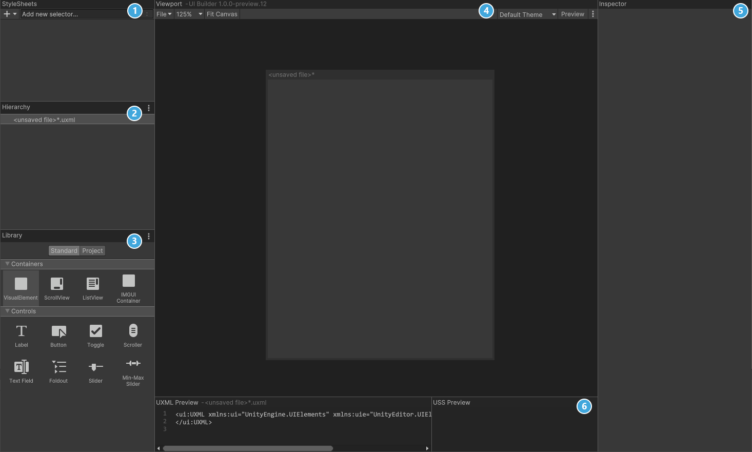
UI Builder is broken out into six different sections:
- StyleSheets: Manage the stylesheets and individual selectors that are used in this document. Style Sheets can be shared across multiple documents, thereby maximising reusability.
- Hierarchy: A list of all elements that are within the document.
- Library: Contains a list of standard elements that can be instantiated. The Standard tab contains UI Documents from Unity. The Project tab contains UI Documents created in your project.
- Viewport: Visual of the UI document.
- Inspector: Contains modifiable attributes and style properties for the element currently selected in the hierarchy or StyleSheet sections.
- Code Preview: Displays the UXML and USS code that UI Builder is generating based on your decisions.