Design 2 - Circular progress bar
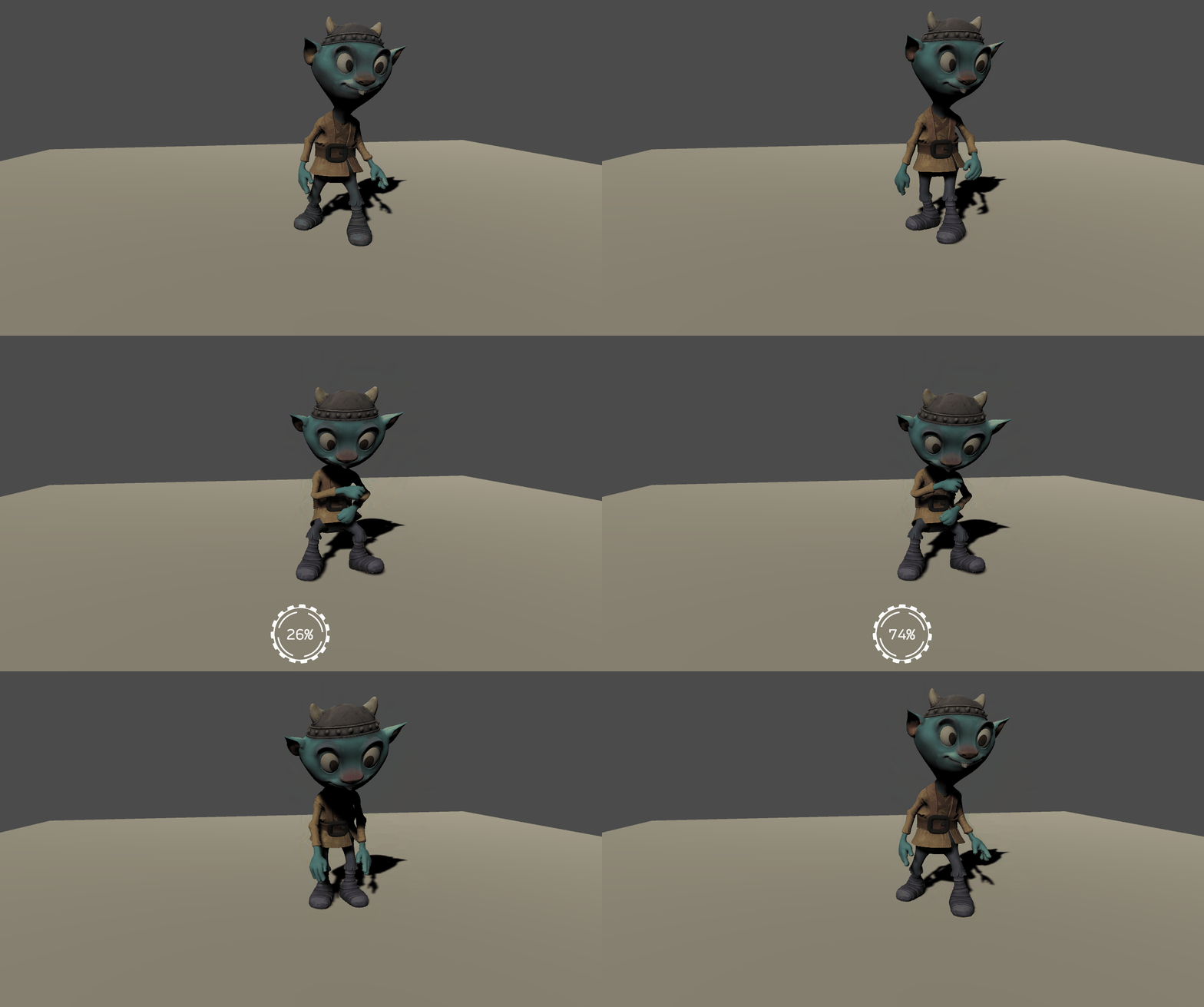
Now that you have gotten a taste of designing and animating a simple progress bar, lets kick it up a notch. In the second half of this tutorial, you will design a circular progress bar with three animations and hook it up to an in-game animation so that it triggers when the player takes a specific action. Here is what the progress “bar” will look like:

Open UI Builder and create a new UI Document by going to File > New. Add a new VisualElement and set the following:
- Name: Container
- Align > Align Items: Center
- Align > Justify Content: Center
- Size > Width & Height: 128px
Drag another VisualElement and make it a child of the Container. Set the following properties:
- Name: Outer_Pivot
- Size > Width & Height: 1px
A pivot point in UI Toolkit defaults to the top left corner. As of the writing of this tutorial, there is no way to change that pivot point. To get around this, any element that you want to rotate from a different pivot needs to have a manual pivot set by creating a parent element and positioning the animated element relative to it. If you did not add the pivot parent, then the images would each pivot from the top corner, rather than center.
Drag another VisualElement and make it a child of Outer_Pivot. Set the following properties:
- Name: Outer_Image
- Position > Left & Top: -64px
- Flex > Shrink: 0
- Size > Width & Height: 128px
- Background > Image: OuterCircle
Drag another VisualElement and make it a child of the Container. Set the following properties:
- Name: Inner_Pivot
- Size > Width & Height: 1px
Making Inner_Pivot a peer of Outer_Pivot will enable you to animate the elements it differently. If you were to instead make Inner_Pivot a child of Outer_Pivot, it would inherit any animations that applied to Outer_Pivot. This could be useful in some scenarios, but not for this design.
Drag another VisualElement and make it a child of Inner_Pivot. Set the following properties:
- Name: Inner_Image
- Position > Left & Top: -50px
- Flex > Shrink: 0
- Size > Width & Height: 100px
- Background > Image: InnerCircle
Add a Label and make it a child of Container. Set the following properties:
- Name: txt_Percentage
- Text: 0%
- Position > Position: Absolute
- Size > Width & Height: 128px
- Text > Font: Recursive
- Text > Size: 30px
- Text > Align: center and middle
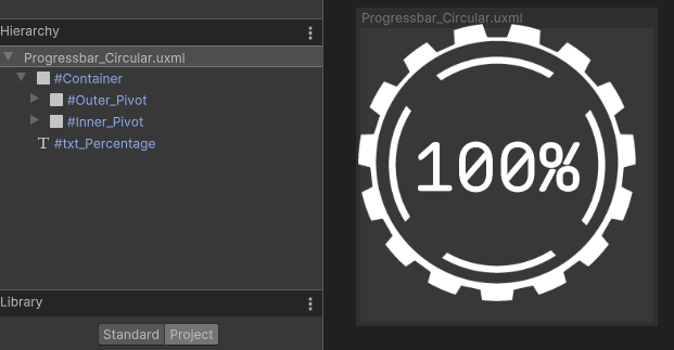
Save the file as Progressbar_Circular. You should now have a window that looks like this:
